In a world populated by around 217 million visually impaired individuals,
is design catering to both the visually impaired and sighted alike?
Should we be reapproaching the way we communicate?
For fully sighted people, Braille usually remains a foreign reading system as it bares no resemblance to the English alphabet. Also, Braille signs are created separately and displayed under or above a larger text, marking a clear differentiation between what is to be read by sighted people and what by the visually impaired.
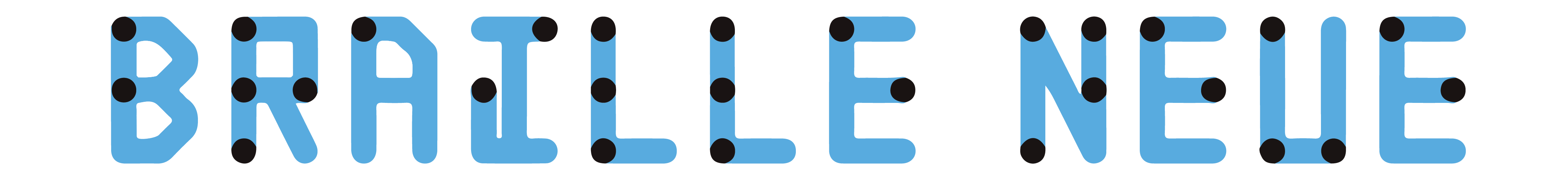
Braille Neue,
designed by
Kosuke Takahashi
pays tribute to Helvetia Neue, in hopes of offering an updated version of Braille so that it can be incorporated more fluently into public spaces.
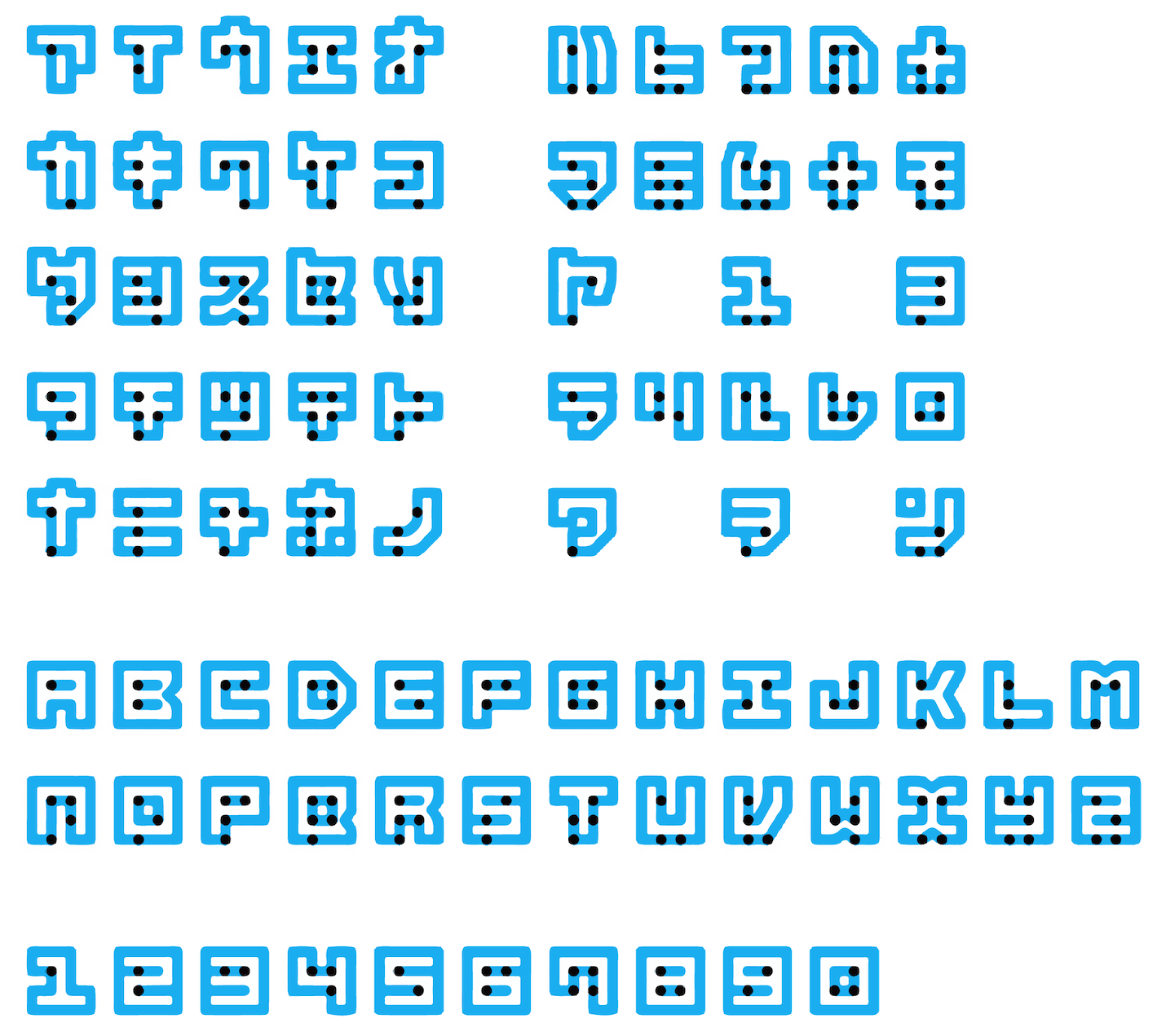
Kosuke Takahashi overlaid letterform strokes onto a grid of corresponding Braille dots. The typeface, which Takahashi describes as "Braille for everyone", aims to communicate to both the sighted and the visually impaired at a glance – or at a touch. This makes it easier to contain information in the same space, instead of one being neglected in favor of space.
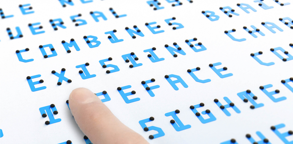
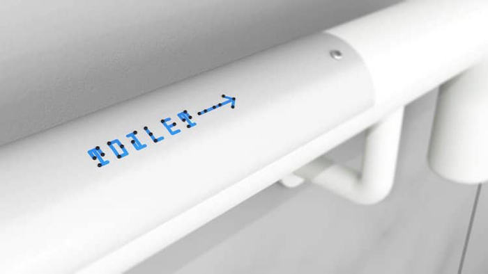
In Braille Neue, Kosuke Takahashi conducted research to see whether braille could be put into design beyond its set scale. Large signages, such as ‘Exit’ signs and toilet signs, could be read by visually impaired people as long as it was still within the boundaries of 6 dots.
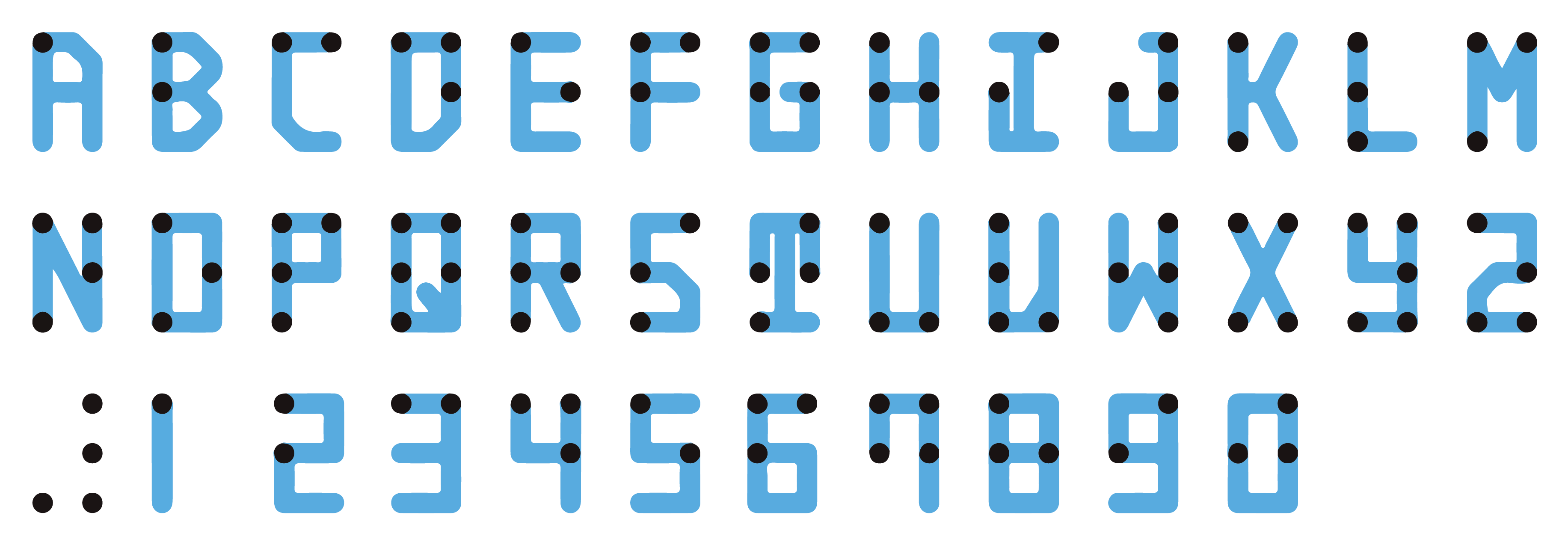
Braille Neue comes in two styles – standard and outline. Braille Neue standard combines tactile Braille dots with Latin alphabets, and Braille Neue outline uses both Latin alphabets and Japanese characters. If embraced to its fullest capacity, Braille Neue outline could be kerned to fit and write over both English and Japanese texts already existing in public spaces.
In Japan, Braille Neue has been implemented at public offices such as the Shibuya City Office and company buildings of Panasonic and Dentsu. Braille Neue also is working towards applying the type to general software and making it accessible to print.
His hope for the typeface is for it to allow braille to be included in signages for public spaces. Takahashi is still experimenting with cost-effective printing and is refining the font prior to final release. Braille Neue has the potential to spread not just awareness but literacy of Braille, given that it essentially serves sighted non-Braille readers as a key every time they approach it. With Braille Neue, it is also possible to overwrite existing signages in public space by adjusting the space between letters. It is easy to implement into existing infrastructure and is a stepping stone for a sustainable and inclusive future.
Further Reading
THE INDEX PROJECT | Braille Neue: The alphabet reinvented for both the visually impaired and sighted
COLOSSAL | A Universal Typeface by Kosuke Takahashi That Combines Braille and Visible Characters
OPEN CULTURE | A New Version of Braille That Can Be Simultaneously Read by the Sighted and the Blind
EYE ON DESIGN | Beyond Braille: A Look at 3 New Typographic Systems for Blind People